The Weather Rescue volunteers have now rescued all the observations written in the Daily Weather Reports for 1900-1903, so it’s time to have a closer look at some of the data. We’ve picked October 1903 as this is the wettest month ever recorded in the UK.
The video below, made by Philip Brohan, looks complicated at first. The left hand side shows an animation of our previous understanding of the atmospheric pressure, for every hour during October 1903. This is produced using a modern weather forecasting model, but the simulations do not include the information in the new rescued observations, which are shown as the red dots.
There are several blue lines on the map (looking a bit like spaghetti!) which show the pressure in different simulations of the past. Because we don’t currently have that many observations to constrain the weather patterns there is a lot of uncertainty about where some of the pressure features are. The thicker black lines show the pressure contours where we are more confident.
The right hand side lists the weather stations in the Daily Weather Reports, and the red bars show the rescued pressure observations. The blue dots show the different simulations for that location and time.
There are lots of interesting features to note. You may notice that the maps often have a sharp adjustment – these are the times at which the existing data is ‘assimilated’ into the simulations. Often the blue dots in the right hand panel show a wide range – when the new observations are included then this uncertainty will reduce substantially. Sometimes the existing simulations (blue dots) are close to the new observations (red bars), but often not. It is these occasions where the new data has most value, and we expect the blue ‘spaghetti’ lines to become much closer to each other.
Importantly, the improvements will be largest when low pressure storms are passing near the stations. We want to learn about the frequency of intense storms in the past to compare with now and these rescued observations will significantly improve our understanding.
We have also made an animation of the rainfall data rescued so far in 1903. Note October in particular as being a very wet month for the UK!
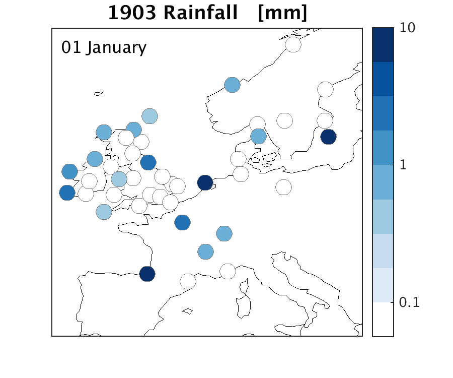

Fascinating stuff. The animation picks out the record-breaking 59-hour deluge in the middle of June 1903 that left vast swaths of what is now the London Borough of Redbridge inundated. The records set still stand today! https://wp.me/p2VSmb-rw
LikeLike
Great work!
LikeLike
Rainfall 1903 animation: Scale only goes to 10mm – surely there was more rain than this in one day!
LikeLiked by 1 person
Hi Elaine – yes, there were a few days with more than 10mm of rain – these would be in the darkest blue also. Will edit the animation to have an extra colour next time!
Thanks!
LikeLike